Did you know that “words” only account for 7% of the overall message you’re trying to convey?
Yup! Only 7%.
The rest?
38% vocal cues i.e. the way those words are said.
55% Non-verbal cues.
(Data: Albert Mehrabian’s 7-38-55 rule, 1960s study!)
Words are essential, yes!!
But it’s the non-verbal elements that give them depth and nuance.
Non-verbal communication = conveying a message without using words.
It’s the silent language we all speak and interpret, often unconsciously.
By incorporating the non-verbal cues into your content strategy, you can:
- Enhance understanding of your message
- Evoke emotions
- Establish a stronger connection with your audience.
It’s what most of your favorite brands and creators use to create resonating content.
How?
Let’s see!!
Contents
🤪 Facial Expressions
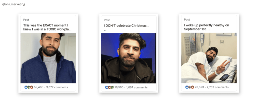
When it comes to content marketing, facial expressions are not limited to in-person interactions.
A compelling image featuring a genuine smile.
Tasleem does this best with his content on LinkedIn.

(Sometimes I even envy him for it!)
Or a captivating video showcasing various emotions.
Both can create an immediate connection with your audience.
Because remember, our faces are powerful communicators.
And a picture is worth a thousand words!
✌🏻 Body Language and Gestures
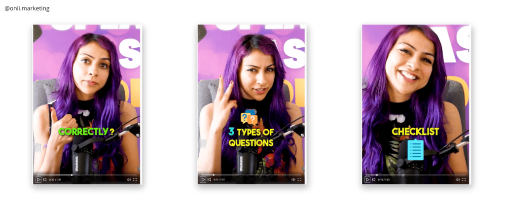
Your body language and gestures can convey a powerful message.
The way we carry ourselves and the movements we make can speak volumes.
Leaning in, hand gestures, or even a slight nod can reinforce your content’s key points and engage readers on a subconscious level.
Non-verbal cues add depth and authenticity to your content.
Making it more relatable and memorable.
Nausheen is literally the queen at this and has mastered to do it extremely well in her videos!!
(Both facial expressions & gestures)

🤩 Visual Elements
Colors. Imagery. Design.
Visual elements are the backbone of content marketing.
Choosing the right color palette. Incorporating compelling imagery. Thoughtful design.
All this can significantly enhance the impact of your content.
The strategic use of colors, imagery, and design can:
- Evoke specific emotions
- Shape brand identity
- Leave a lasting impression on your audience.
It’s the reason why my entire branding is red.
Because it’s considered bold & aggressive.
(Plus people told me that red is a bad color to use in your brand!!)
📝 Typography and Font Choices
Did you know that different fonts and typography styles have their own personalities?
Yup!
From bold and authoritative to playful and creative, your font choices can set the tone and enhance the message you want to convey.
Which of these two makes more sense?

Exactly!
So, make sure your typography aligns with your brand voice and the emotions you want to evoke.
In marketing, you need to choose your words wisely.
Both in content and font!
(I found this great graphic (below) and this article on Font psychology that you’d find extremely useful.)

🤏 Use of Space and Layout
The way you utilize space and structure your content can:
- Create a sense of balance
- Guide the reader’s eye
- Enhance the overall user experience
Thoughtful spacing. Clear hierarchy. Intuitive layouts.
These can make your content more digestible and visually appealing.
Because remember…
Sometimes less can be more!
It’s the reason why Apple uses a minimalistic style.
🧠 Keep In Mind
Copywriting and words are good.
They plan an important role in your marketing.
But by non-verbal cues in your content marketing?
You can captivate, engage, and build meaningful connections with your audience beyond just words.
And remember…
Every element you choose shapes the narrative and conveys a message.
So, make every visual choice count!
Found this article helpful?
Join The Marketing Fundamentals Newsletter for FREE. Learn how to build solid marketing foundations for your business. Doing the boring stuff. Stuff that (actually) builds brands. With only one power-packed email per week. Every Tuesday.
(No daily spam or jargon… just pure value!)


0 Comments