Your landing page is one of the most important elements of your marketing strategy.
And it can have a significant impact on the success of your marketing campaigns as well as your overall business.
If your landing page is not optimized for conversions, you could be losing potential customers or leads.
So, when a client booked a power hour call with me, they wanted to discuss how they can improve their landing page conversions.
Previously it was converting at nearly 2.35%.
But after implementing the tips I shared with them?
It started converting at a whopping 50+% conversion rate.
So, today I’m sharing those tips here with you.
Now, of course, one thing I’d like to mention here is that these were personalized tips for their landing page and these may or may not work for you.
But generally, they do.
If you’d like to book your own power hour call with me to discuss how you can solve your marketing/conversion problems, book your call from here.
Now, on to the tips.
Contents
1// Cutting the distractions
The old page was filled with a lot of useless things that were distracting the user from doing what we wanted them to do on the landing page.
i.e. sign up.
These distractions were: a header menu with 5 links, a footer menu with 4 links, and social sharing buttons.
Too many options to choose from for the user.
The more the number of options for the user, the lesser the conversions.
How do you fix that?
Decluttering and removing all that shit and just giving two options to the user.
Sign-up or leave.
And if you do the other 4 things in this list right, they’d mostly choose the first option.
2// The Z technique
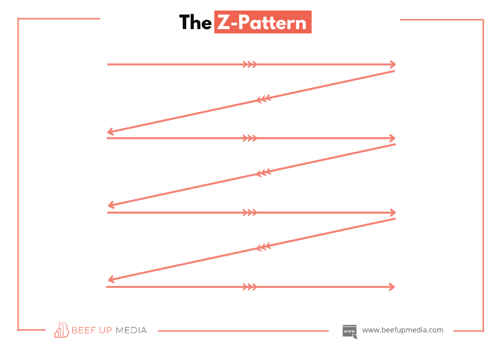
This is a very interesting psychological phenomenon.
Whenever we’re reading/scanning a webpage we do it in a Z pattern.
Going from left to right, left to right.

This comes from years of evolution of reading books or other texts in just the same manner.
How do you use it to your advantage?
Adding the information in the Z-order makes it easier for the user to consume that info.
And the easier the consumption of the information, the higher the conversions.
3// Clear and concise language
Previously there was just too much confusing or technical language being used.
When your goal from a landing page is to get subscribers, you don’t need all that.
You have to pick simplicity and go for clarity over cleverness.
We shifted the focus from sounding smart to being clear.
Tip?
Avoid using technical jargon on your landing pages if you want more of your target audience to convert.
Sometimes, trying to be too smart does more harm than good.
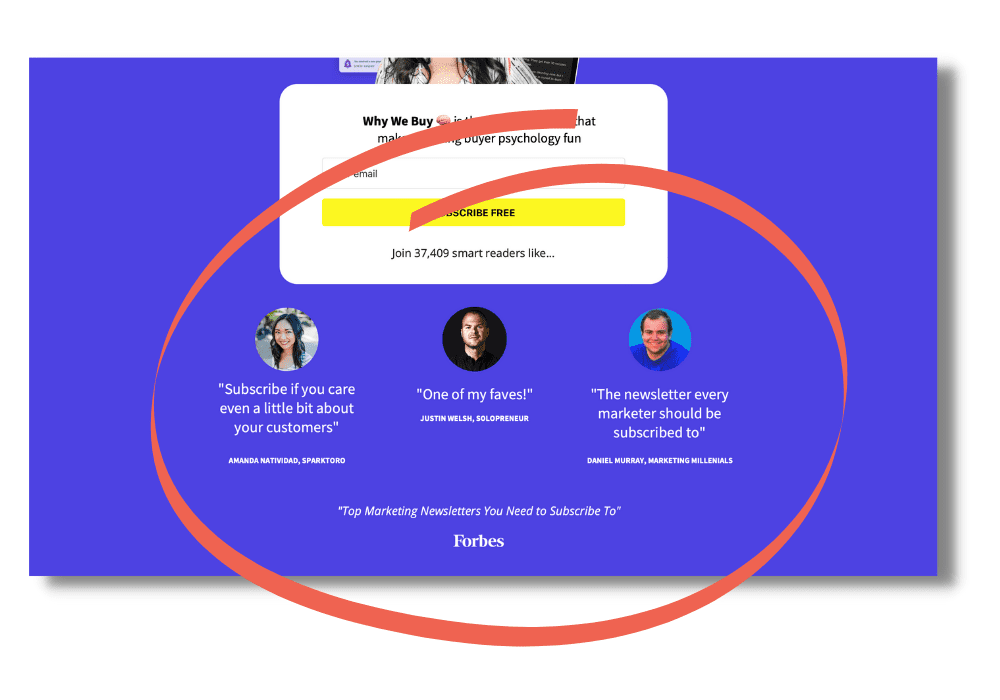
4// Adding social proof
Social proof can not just be vital for increasing sales but increasing email signups as well.
Or basically getting any action.
Why?
Bandwagon effect and credibility.
When humans see a lot of folks doing something, they want to jump on that train too.
Or when they see some of their favourite leaders doing something, they want to do it as well.
Precisely why you need to use social proof, and you need to use it strategically if you wanna get people to act.
Katelyn does it really well. ↓

5// Adding privacy info
This is often missed by so many folks.
I hardly ever see anybody doing this.
Just adding a simple “Your info is totally safe and we promise not to send you any kind of spam” can make a huge impact.
Why?
People receive a lot of spam in their inboxes and so these days they are quite resistant to giving their emails.
Adding a simple message “privacy info” message can put them at ease and reduce that resistance.
Meaning…
More sign-ups for you.
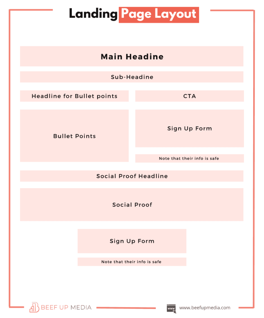
Landing page layout
Now, of course, I can’t share the actual landing page.
But what I CAN share with you?
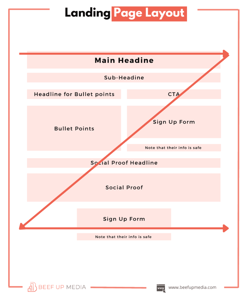
The landing page layout.

Also, can you see how smoothly it follows the Z-pattern?

So, go ahead and try this layout for your own landing page.
It’s tested and I can bet you’ll get some great results from it.
Also Read: 3 Reasons why your target customers aren’t buying and how to fix it
Final words
Could we further increase the conversions?
Yes.
It would come down to A/B testing individual elements and copy… which is an ongoing process.
It makes granular differences that keep adding up.
But remember…
Getting conversions is not about making noise.
It’s about communicating clearly and making sure your message goes across well.
And If you need some help implementing a full-funnel marketing strategy for your brand or increasing your conversions, book a free strategy call, and let’s have a chat.


0 Comments